Music Venue Trust
Music Venue Trust is the UK charity dedicated to protecting and supporting grassroots music venues, facing increasing financial pressures threatening their future.
A new chapter for Big Orange – 10 years in.
We’ve spent a lot of time over the last ten years helping other businesses work out who they are and how to tell their story. This time, it was our turn. The agency had evolved, and it was time our brand caught up.
Big Orange Media no longer told the full story of our people, our expertise or our ambitions. We wanted an identity that reflected the agency we had become and one that also gave us room to grow. That meant taking a good look at ourselves. What makes us different? What do we value? And how do we want to show up in a creative industry being reshaped by AI?
We wanted to feel more confident in how we presented ourselves, while keeping the warmth and personality that people knew us for. And with AI changing the creative industry, we knew we needed to articulate something we felt strongly about: the value of authentic creativity.
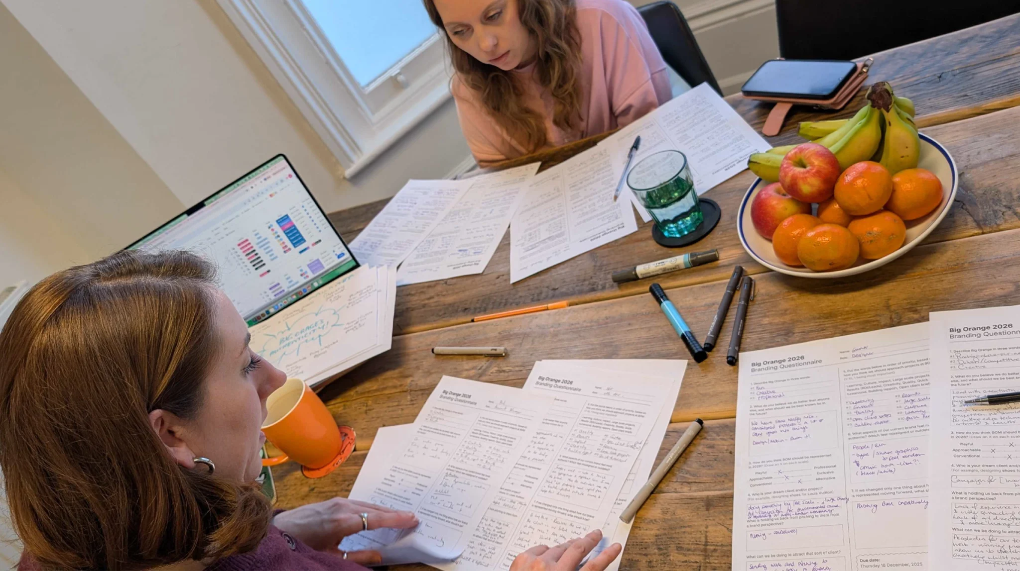
We started with the people who know Big Orange best.
Through team engagement and feedback, we explored our personality, strengths and priorities – looking at how we thought we were perceived and where we wanted to go. By giving everyone across the business a voice, we aimed to create a new identity that every person could get on board with and truly advocate for.
The team described an agency that was creative, ambitious, warm and approachable. A close-knit group that cared about its clients, supported each other and enjoyed making good work.
There was plenty we wanted to hold on to – our close relationships with clients, our willingness to try things and the enjoyment we genuinely get from working together. The conversations also challenged us. We wanted to move beyond being seen as an emerging agency punching above its weight and present ourselves with the confidence of the established creative partner that we are. Creativity, quality and impact needed to lead the story.
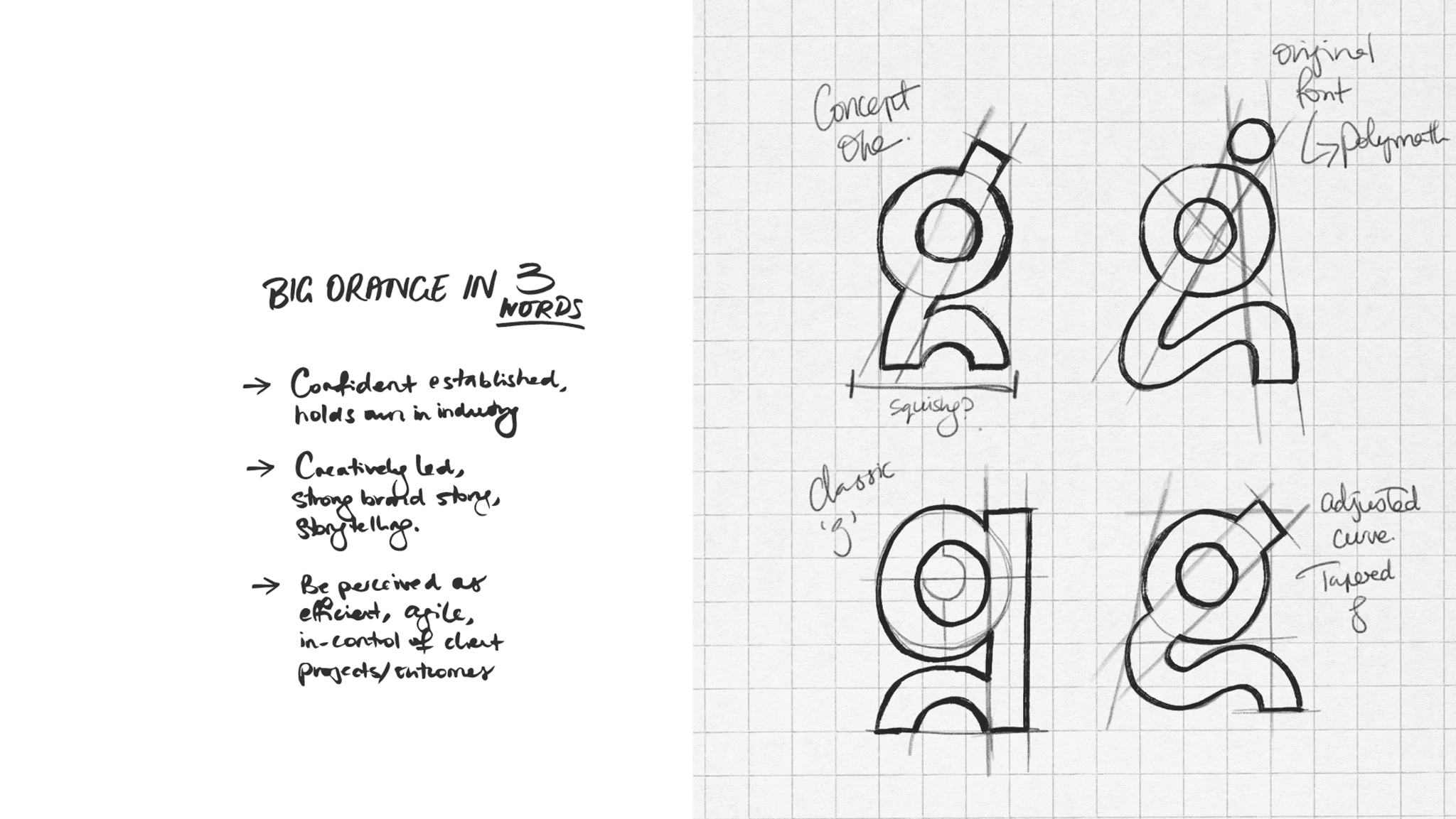
Every one of our designers created brand concepts, bringing different perspectives into the process and giving us plenty to debate and develop. Opening up the creative process gave us a breadth of ideas to explore and discuss. It also put our own collaborative approach into practice, with the people behind the work helping shape the brand that represented them.
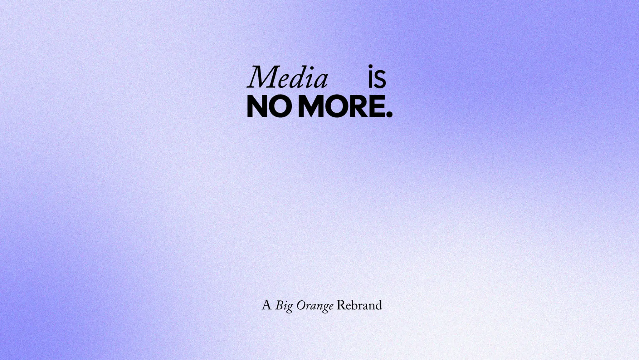
We also made a simple but significant change: Big Orange Media became Big Orange. Dropping ‘Media’ gave us a name that better suited the breadth of our work and felt more natural to say. It was still recognisably us, with more room for what comes next.
At the heart of the identity was authentic creativity: the ideas, judgement and individual perspectives our people bring to every project to make the work stand out and deliver meaningful results. As AI becomes part of more creative workflows, we wanted to give our own creative voice greater presence. The current landscape is crowded with quick fixes and familiar-looking content, making us believe more than ever in the value of work that starts with a dynamic conversation and brings a fresh or unexpected idea to the table. Our new identity needed to express that belief, with the personality and confidence to catch people’s attention and give them something worth connecting with.
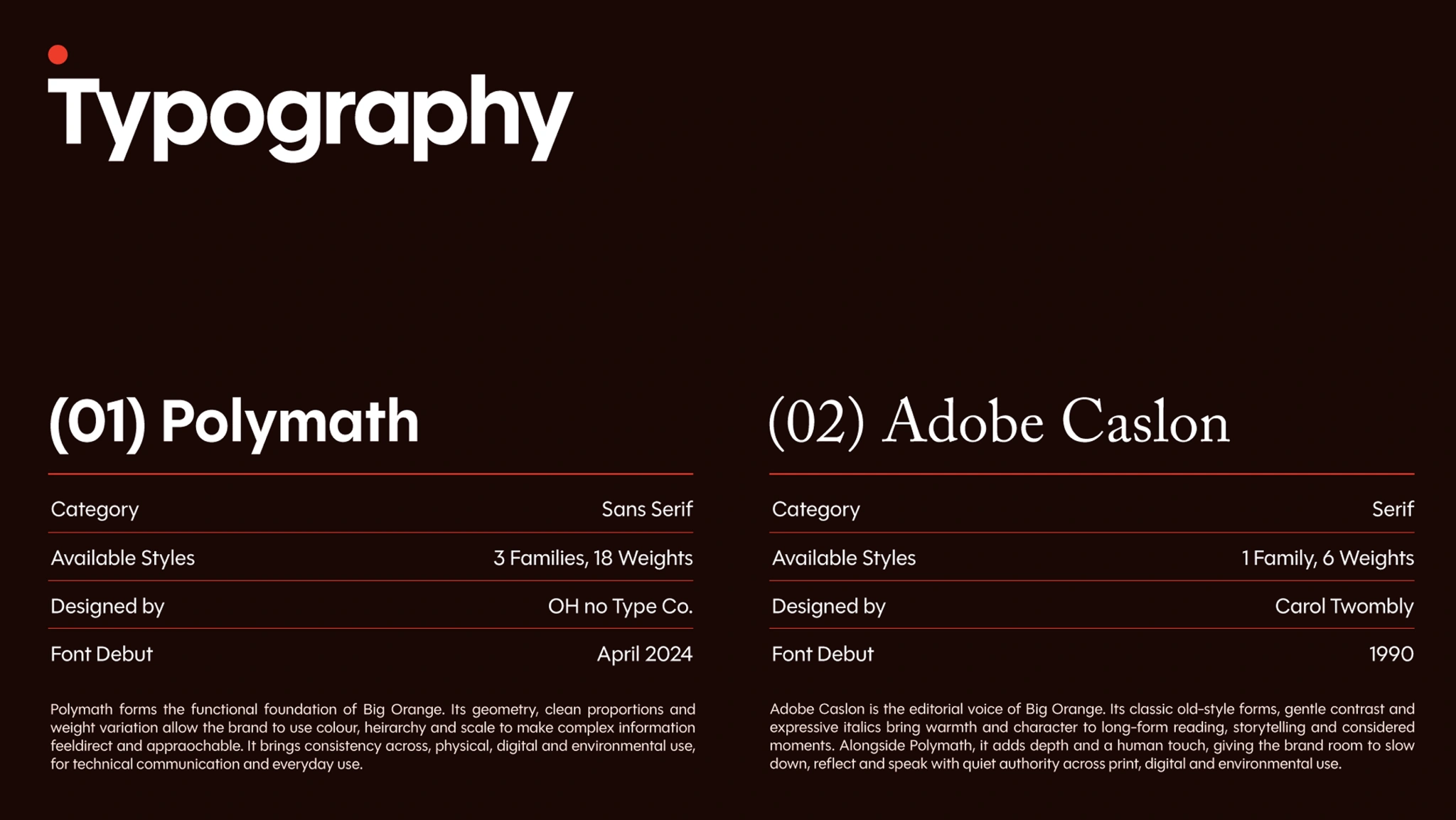
The identity centres on a bold, lowercase wordmark, with heavy, rounded lettering showing our confident presence, and softer shapes keep it friendly and approachable.
Bespoke typography gave us room to explore that balance between confidence and character. The custom ‘g’ adds an unexpected twist to the lettering, with a sweeping tail that brings movement into an otherwise solid wordmark. Designed with motion in mind, it’s a distinctive detail that showcases our creativity and attention to detail.
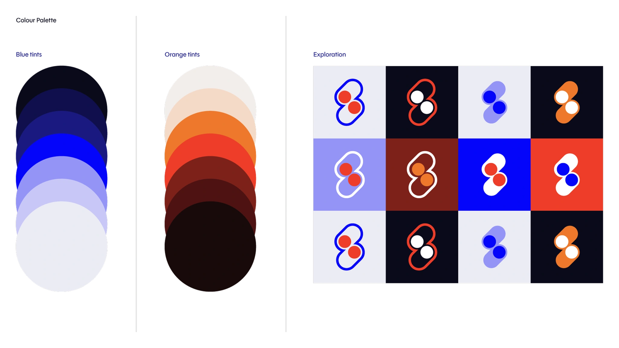
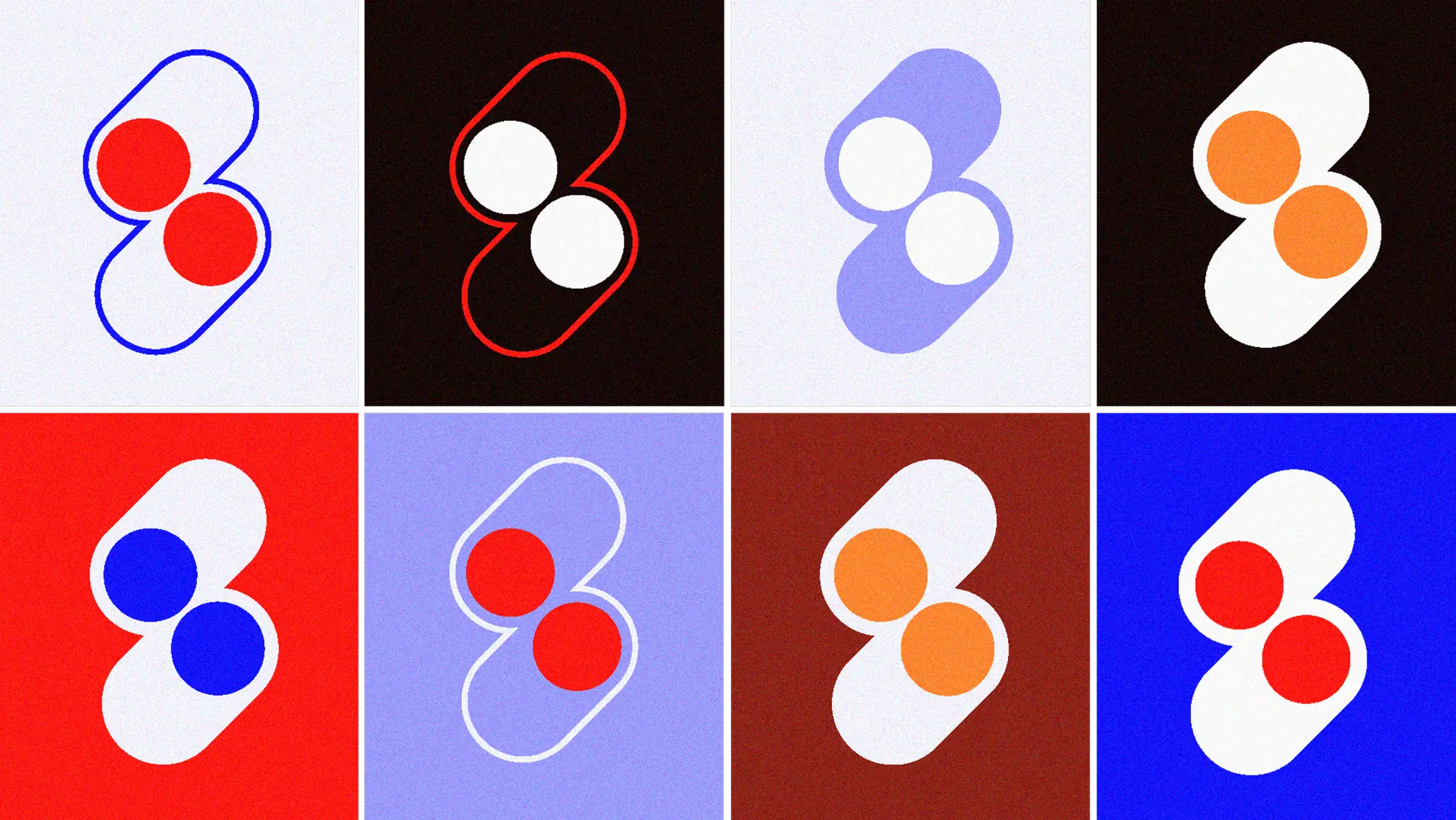
We also reconsidered how we used our namesake colour. Orange became a deliberate accent – a small, bright dot against the black lettering. It gives the logo a playful finishing touch without needing to flood everything with colour.
These choices give the brand a clear personality… bold enough to make an impression, warm enough to invite a conversation and individual enough to feel like us.
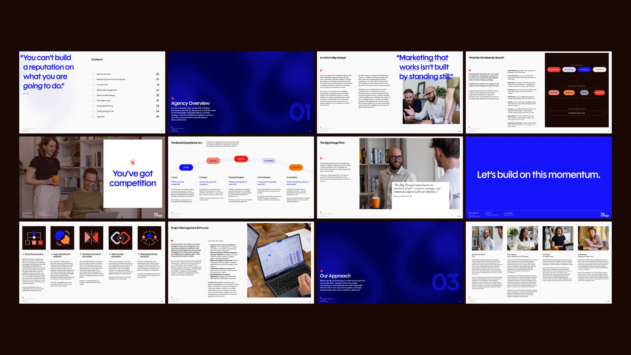
The brand rollout was a substantial part of the project. The identity needed to work wherever someone encountered Big Orange, from a first look at our social channels to a presentation or a piece of video content.
We carried the new direction through pitch decks, social assets, videos and the wider materials we use to introduce ourselves and share our work. Each format brought different demands – from a deck needing to make a clear, persuasive argument, to social content to catch someone’s attention and video that gave us room to explore movement and personality.
We wanted to make all of it feel like it came from the same team, with enough variety to keep things interesting. Applying the identity across these everyday uses helped turn a set of design decisions into a working brand.
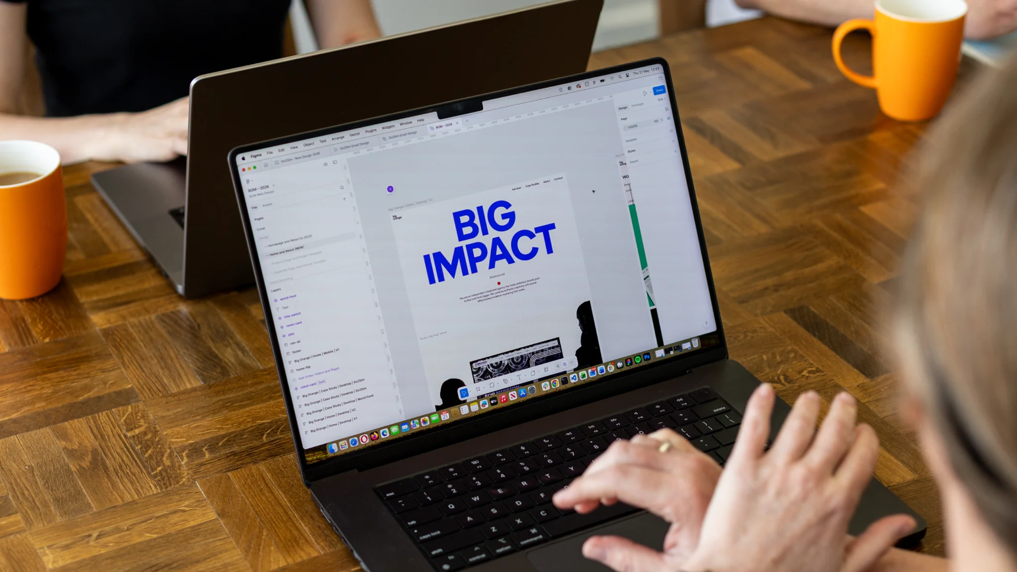
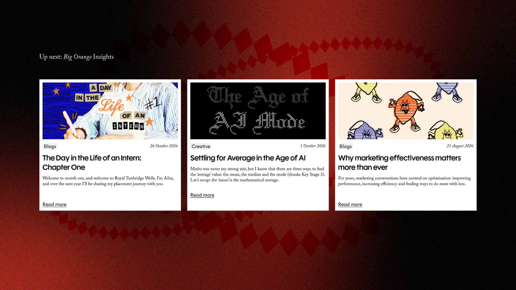
The new website brought everything together. It needed to capture the personality of the brand, show the breadth of our expertise and give prospective clients a clear sense of what working with us could look like.
We wanted the experience itself to demonstrate our capabilities. Our designers and developers worked closely to translate the identity into a site that felt expressive and considered, with animation bringing energy to the pages and giving us another way to communicate our character. We paid attention to the quieter details too – closely considering how content was arranged, how each page flowed and how easily visitors could find what they needed.
Our work sits at the centre of the site. We gave case studies space to tell a fuller story, showing the thinking behind a project alongside the finished work. Bringing together design, video and motion helped us present projects in ways that suited the work, while giving visitors a better understanding of how we approach a brief and what we can deliver.
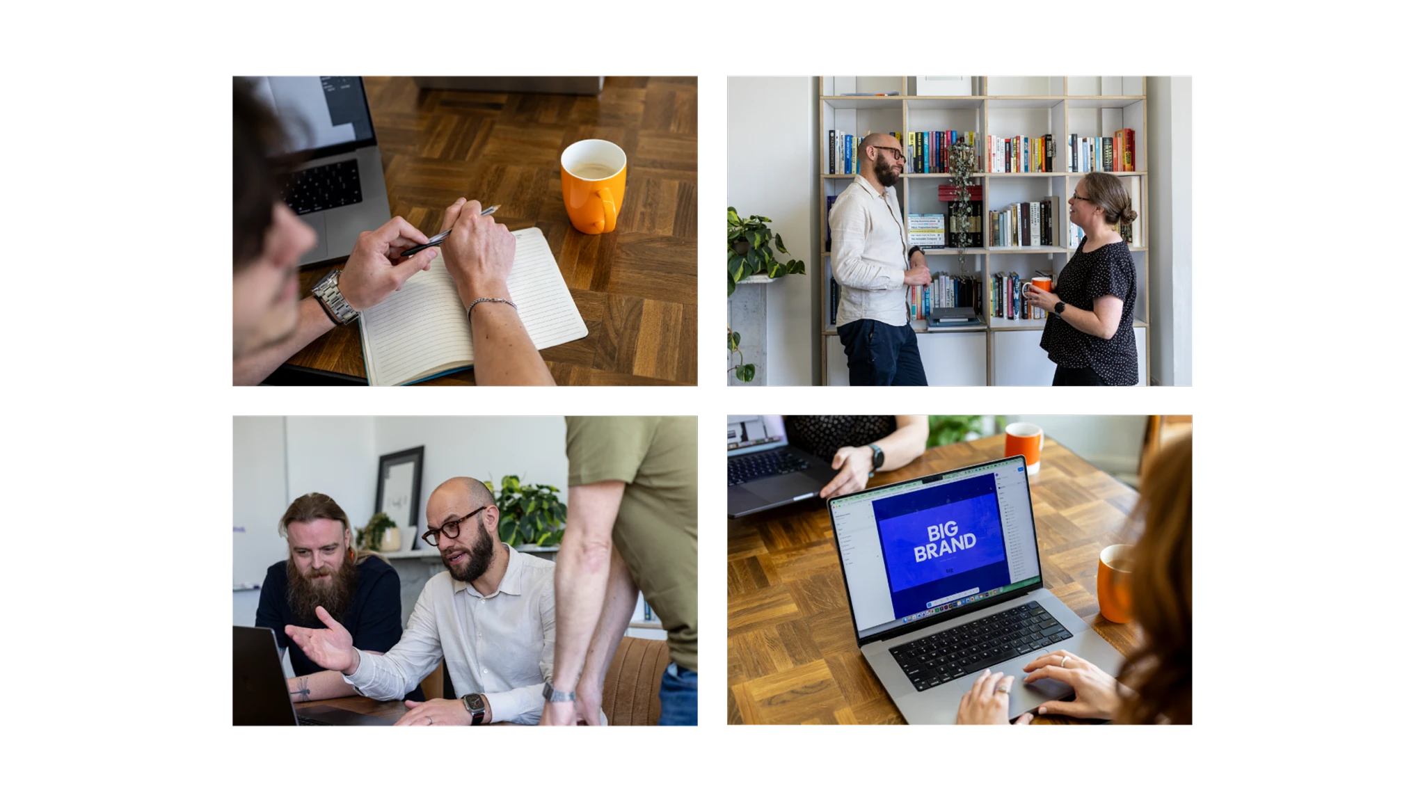
We also wanted people to get a feel for the team behind it all. Alongside our services and projects, the site makes room for our people and the collaborative culture that shapes our work. That mattered to us because the relationships we build are a big part of why clients choose us and stay with us.
Throughout, we balanced creative ambition with ease of use. Clear navigation, readable content and straightforward routes to get in touch give the site a practical foundation, allowing the more playful elements to do their job without getting in the way.
The result is a website that gives our work the attention it deserves, expresses who we are and sets the tone for the projects and partnerships we want to build next.
We now have a brand that feels much closer to the agency we are, and something that fully represents our values, experience and ambition as a business.
The new name and identity carry throughout all of our channels, giving us a consistent way to show up and a stronger foundation to build on. Just as importantly, the process gave us time to talk about our own future, with the whole team helping to define what we wanted to be known for, then helped bring it to life.
Every part of the brand now carries the confidence we bring to our clients’ work and is a statement of where Big Orange is heading, with an expression of authentic creativity at its heart.
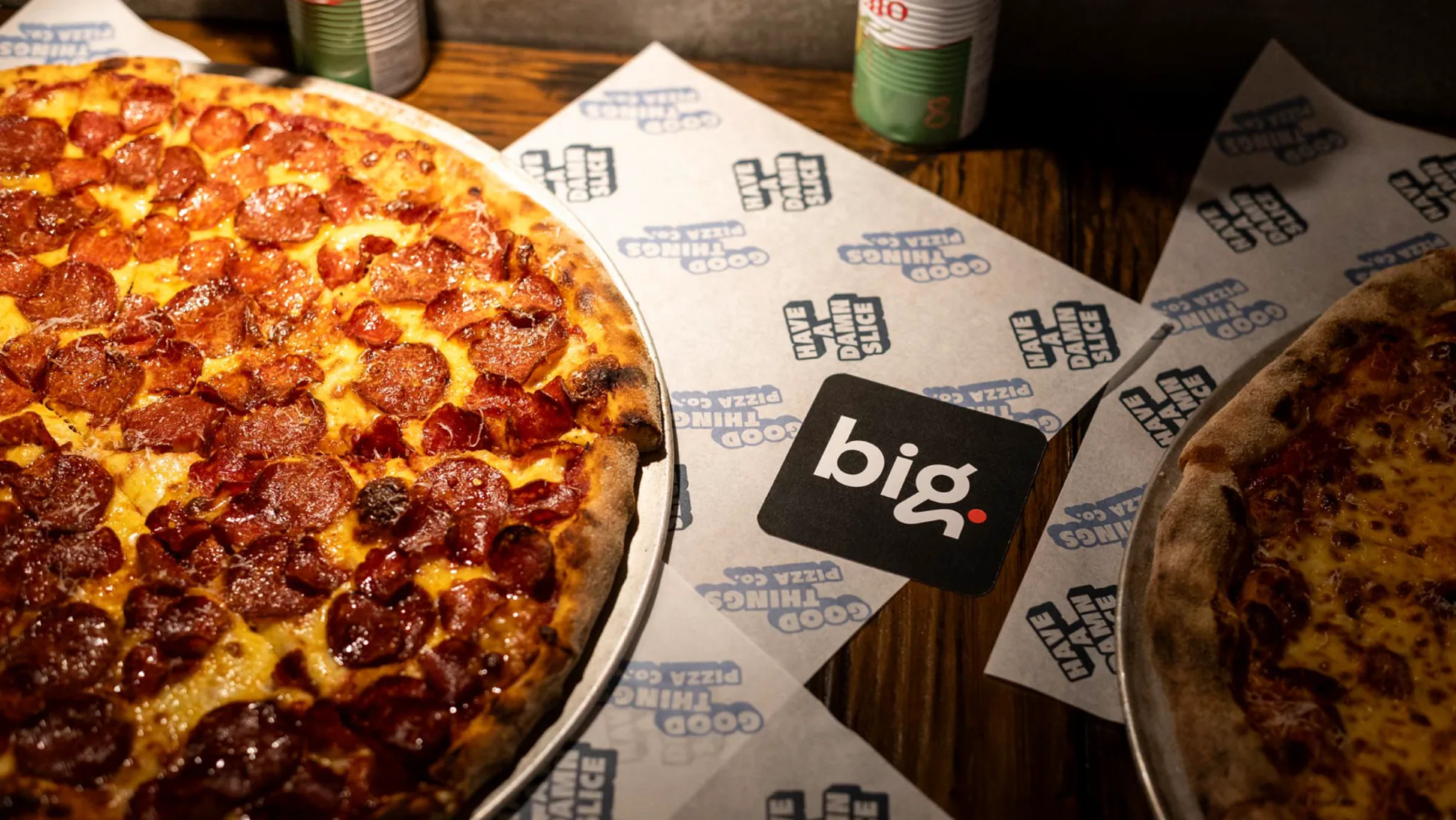
Music Venue Trust is the UK charity dedicated to protecting and supporting grassroots music venues, facing increasing financial pressures threatening their future.
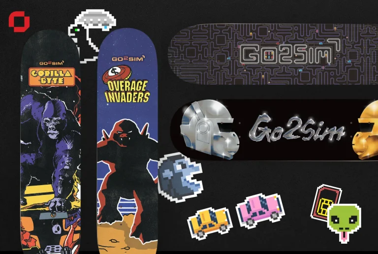
With a reputation as a competitive provider of professional SIM cards and routers, Go2Sim serves a diverse customer base with a…

We transformed Brown Europe into Brown GearTech with a complete rebrand, digital platform and content ecosystem, helping reposition an established engineering business as a confident, forward-thinking partner for high-value OEMs.
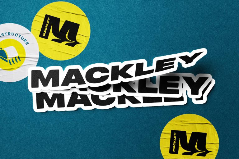
Brand strategy, creation and delivery for a South-Eastern civil engineer constractor. With a strong sustainability mission…